Pop-Ups
This guide will instruct you on how and when to include a pop-up.
WHAT IS A POP-UP?
Love ‘em or hate ‘em, pop-ups — also called modals or overlays — can be an effective way related, relevant, and simple information within the website without having to intrude on the well-designed page.
A pop-up is a window or dialog that appears on top of the page content. A pop-up can be classified two ways:
1. Whether the user can interact with the rest of the page:
- Modal: the content on the page is disabled until the user explicitly interacts with the overlay.
- ALL Hibu added pop-ups are modal.
- Nonmodal: users can still interact with the background content (for example, by selecting links or tapping buttons) while the overlay remains visible.
- There are no options to add a nonmodal pop in HWP
- If the background is dimmed, the pop-up is called a lightbox pop-up.
- ALL Hibu added pop-ups are lightbox.

TWO TYPES MODAL POP-UPs
1. Click Pop-Ups
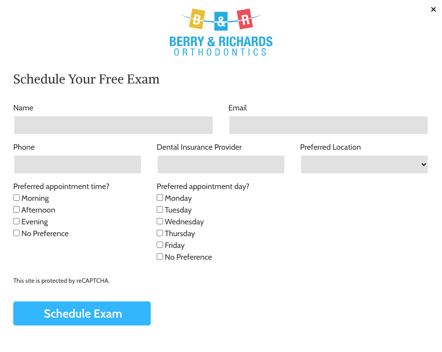
See Click Pop-Up Example
Read more
- Click-pop-ups are activated when a visitor clicks on a designated button, link, image, icon, or word.
- They’re the only pop-up that occurs because of an action. Because of this, they’re the least intrusive of all pop-ups.
2. Timed Pop-Ups
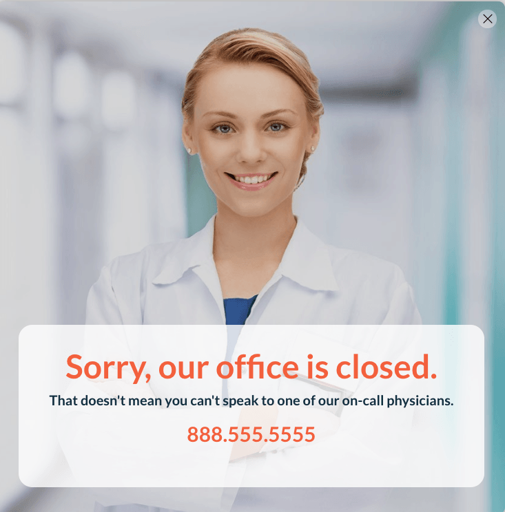
See Timed Pop-Up Example
- Timed pop-ups work by appearing after a visitor has remained there for a designated amount of time.
- inSites display timed pop-ups.
POP-UP WRITING AND DESIGN TIPS
Match the rest of your site
- When you design your pop-up, you want it to feel like it's a part of your site, rather than an intrusion. The way to achieve that is to match the style, colors, and typography of the rest of the site. That way, when your pop-up does appear, it will feel like part of the experience, rather than an outside force inserting itself into the site.
Have a clear CTA
- In most cases, you're probably displaying a pop-up on your site because you want your visitors to do “something." That something
could be signing up to email list, checking out a special offer, sharing on social media, learning about a new service, team member, visit, etc.
To drive people towards performing that action, you want to have a single button with a strong call to action (CTA): Learn More, Get Deals, Share Us, Follow Us, Join Now, Sign Up, Visit Us. The CTA should be simple and always tells visitors exactly what to do.
Visually the CTA should be the centrepiece of your display box -- giving the visitors a compelling reason to click to learn more, get details, etc. - Note, it's perfectly acceptable to use a pop-up to display a photo, directions, hours, a definition, etc. and NOT include a CTA. See example.
Use Hibu Callout Widget for "Call Now" CTAs
- If the CTA is Call Now use the Hibu Callout widget to create your pop. This way you can display the text phone number for desktop and tablet and a button for mobile.

Use contrasting colors for your CTA
- A compelling CTA isn't just about the text, it's also about grabbing your visitors' attention in other ways. Namely, color.
You want to use a color that contrasts with the rest of your pop-up to specifically draw visitors' eyeballs right to the button that you want them to click. Again, all in keeping with site palette.

Remember mobile (and treat it differently)
- Hibu website web traffic is 70/30 between mobile and desktop visitors. When you're designing popups, though, it's easy to forget about that and just focus on the desktop experience of your pop-ups. ALWAYS check how the pop-up looks on mobile and be prepared to adjust height, width, and text size and alignment.
Keep Pop-Up Content Simple - Less is More
- The pop-up should be specific to one
intent -- help the visitor to do “something." If the intent is greater or multifaceted then you should add as a row of content or a unique page. Remember, pop-ups should not be used as a substitute for a full page.
As a rule of thumb if the pop-up has a vertical and/or horizontal scrollbars then there's too much content.
Note, all that content and not one CTA.
Use fewer form fields
- Make your info request to the point. Don’t get personal. An e-mail is a standard and expected data requirement. If you need anything else make sure they can click a button or select promptly from a drop down box. As a best practice if there are more that 4 fields to the pop-up form then add the form to a new row or create a stand-alone page